AsoBox
AsoBox is a shipping and package forwarding service created to help members of Amazon's employee solidarity association access products and deliveries more easily. The project focused on developing a clear and approachable brand identity that reflects reliability, efficiency, and trust while simplifying a complex service for its audience.
Client
AsoBox
Scope
Visual Identity
Industry
Shipping Services
Extending a trusted brand into a new service
AsoAmazon was launching a new courier service for its members and needed an identity that could clearly communicate the service offering while remaining visually connected to the association's established brand. The challenge was to create a recognizable and trustworthy identity that balanced two objectives: differentiating the courier service while preserving the equity and familiarity already associated with the AsoAmazon name.

Building on a symbol of solidarity
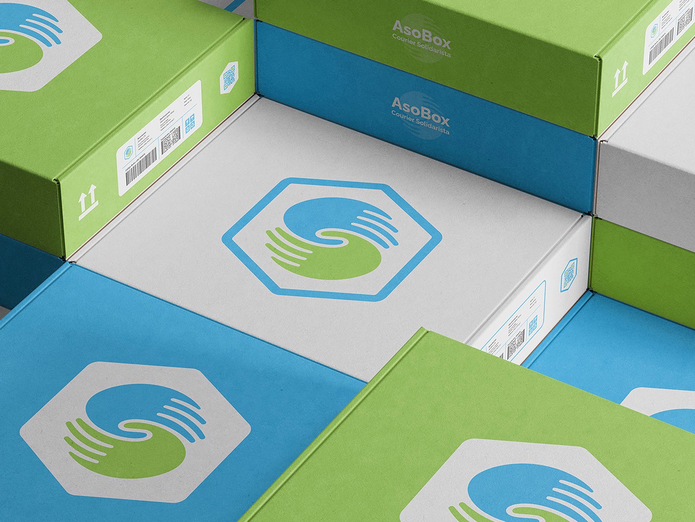
The solution was rooted in one of AsoAmazon's most recognizable visual assets: its interconnected hands symbol. Rather than creating an entirely new visual language, the identity evolved existing brand elements into a modern courier-focused mark.
The symbol combines the concept of solidarity and community with a box-shaped structure that references shipping, delivery, and logistics. By retaining the parent brand's colors and visual cues, the resulting identity feels both familiar and purpose-built, creating a seamless extension of the AsoAmazon ecosystem while establishing a clear presence for the new service.